
Human factor engineer
Usability Study
Mobile app
A project sponsored by Lime
Eight riders, half of them first-timers, on a vehicle Lime was deciding whether to build.

My Role
UX Researcher
Human Factor Engineer
Deliverables
Competitor Analysis
Usability Test Report
Evaluative Analysis
Team
Dave (Tianxiang) Cai - UX Researcher
Alex Boltz - UX Researcher
Diana Fakhoury - UX Researcher
Paty Gomez - UX Researcher
Zelia Lai - UX Researcher
Val Najera - Senior UX Researcher, Lime
Time
Jan 2023 – Mar 2023
The findings are the team’s. The screens are mine.
Five of us ran this study in a usability studies course at the University of Washington, sponsored by Lime. I was in it throughout, including the study design and the analysis. The findings are the team’s, which is why this page says we.
What I took out of it was a question: when a rider stops understanding, what do they do next? The four screens further down are my answer to it — mine, and nothing Lime ships came out of them. They were never built or tested. That is where to judge the design direction.
A vehicle for people who had never ridden one
Lime sponsored this study while deciding whether to build a seated, throttle-driven vehicle of its own — a control layout most riders have no model for. The question was never which vehicle people prefer. It was whether someone who had never ridden one could get on it and go, without an accident and without giving up.
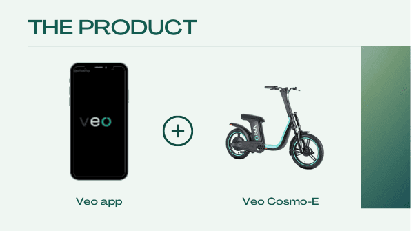
The system under test: the Veo companion app and the Veo Cosmo-E.
Four riders who knew. Four who had never touched one.
8
participants — four experienced riders, four who had never ridden an e-vehicle
2
vehicles compared — Veo’s Cosmo-E seated e-scooter against Lime’s Gen-3 e-bike
7
tasks per session — from downloading the app to reading back what the trip cost
2
environments — a closed courtyard first, then a live shared-use trail
6
findings taken to Lime’s research and vehicle R&D teams, alongside a severity-ranked log of every issue we logged across the app and the hardware
What they expected before they touched it
Before anyone rode anything we parked both vehicles side by side and asked people to talk us through what they saw. The vocabulary split cleanly.
Veo Cosmo-E
Modern
Exciting
Clean
Intimidating
Enjoyable
Lime e-bike
Dirty
Unsafe
Familiar
Utilitarian
Annoying
New riders leaned towards the Cosmo-E: the seat looked comfortable, nothing needed adjusting, the size felt safe and it looked maintained. Experienced riders still reached for Lime — they expected to be able to find one, the app was a lower barrier to entry, and it had a basket and a phone mount. For most participants graffiti read as poor maintenance, and pulled both attractiveness and approachability down with it.

Component-level reactions across both vehicles. The Cosmo-E won on seat, throttle and finish; the Lime e-bike won on basket, phone mount and an adjustable seat.
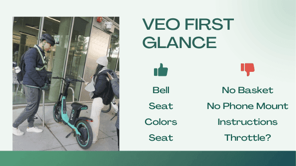
First-glance reactions to the Cosmo-E: the bell, seat and colours landed; the missing basket, missing phone mount and unexplained throttle did not.
Confusion had a shape — and it was different for each group
The same obstacles stopped one group and not the other. What differed was not who was taller or stronger, but what they did next.
Had a model
Predicted what the app would do before touching it
Improvised past the failed QR scan
Found the throttle
Had none
Stopped when the scan failed
Reached for the pedals — the model they already had
Spent longer on the kickstand; some never got it down
The instruction sticker was on the stem the whole time. Most participants never mentioned it, and our own note explains why: riders believe they already know how to ride.
“It’s so heavy! Okay, I will try and move… Okay, I cannot, I give up.”
P5
“If I was by myself doing it, I would feel like it was because I was dumb. I’d feel embarrassed.”
P6
Where the vehicle fought the rider’s body
Riders enjoyed the ride itself. The friction sat in the parts that did not match what their bodies expected.
What worked
A low step-through made it easy to mount and dismount
The handlebar-to-seat ratio let riders sit upright
Shocks gave a smooth ride
The seat cushion was comfortable
What did not
Seat height was not conducive to pedalling
The pedal-to-seat ratio was especially uncomfortable for tall riders
Handlebars felt too wide, and the turning radius too small
Smaller wheels meant less distance per revolution
The centre stand was a major pain point for inexperienced riders
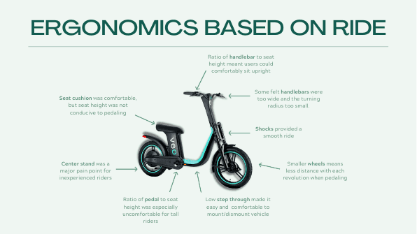
Ergonomic findings mapped onto the vehicle, from the step-through height to the centre stand.
Two lines, two groups, and the gap between them
Plotting new riders against experienced riders showed the experience is not uniformly hard. It has two specific troughs, and they are not where a product team would guess.
Trough one is scanning to download the app. New riders bottomed out here before they had touched the vehicle.
Trough two is the kickstand — raising it at the start and lowering it at the end. Experienced riders dropped here too.
Between the two, riding was the high point for both groups. The product is not the problem; getting into and out of it is.
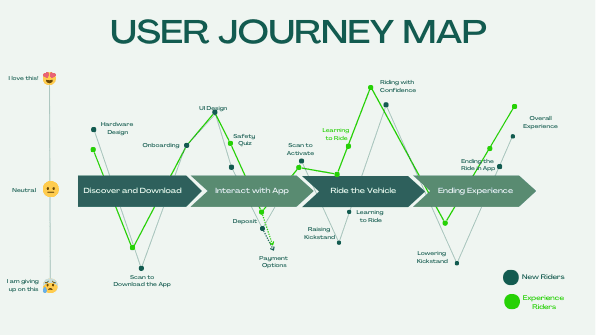
Emotional journey across four stages, new riders against experienced riders.
Six findings, and what each one costs
Six findings went to Lime’s user research and vehicle R&D teams. Each is framed the way the team worked through it: what we saw, why it happened, what it costs, and what to do about it. Severity runs 0 to 4 — 0 is not a usability problem, 4 is a usability catastrophe.
01
Curb appeal
Severity 0
All eight participants preferred a wider, more comfortable seat.

What we saw
Participants preferred the shape and cushion of the Cosmo-E seat, and preferred not having to adjust the seat position at all.
Why
Hard, triangular Lime seats cause pain, and a seat post you cannot twist is an irritation on every ride.
So what
The most consistent preference in the whole study. Better seat, better ride.
Recommendation
Replicate the Cosmo-E seat: wide, padded foam, fixed height.
“I think these seats look much better than the lime ones.”
P1
02
Curb appeal
Storage matters — but only if it is clean.

What we saw
Participants liked the convenience of Lime’s basket but noticed it was dirty. They liked the idea of a phone mount, but found this one weak.
Why
People need to carry things, and they do not want those things to get wet, dirty or broken.
So what
A dirty basket turns Lime’s strongest curb-appeal advantage into a reason to walk past the bike.
Recommendation
Closed, waterproof storage on the next vehicle — and a maintenance cycle that actually checks it.
“It’s really dirty, though. That’s kind of… yeah, that will determine if I’m choosing this bike.”
P4
03
Riding experience
Severity 4
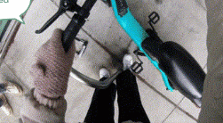
Most participants could not operate the centre stand.
What we saw
Trial and error for nearly everyone. Smaller participants could not lower it at all, and different parking postures produced different results.
Why
A centre stand does not fit riders’ mental models, there were no instructions anywhere, and the vehicle is heavy.
So what
Abandonment, injury risk, and cosmetic damage when riders give up and lay the vehicle on its side. The ride clock keeps running the whole time.
Recommendation
A one-sided kickstand, or a centre stand with a pivot arm — plus in-app instruction at the point of need.
“How do I get it out of this though? Okay. I’m so confused.”
P4
“If I was by myself doing it, I would feel like it was because I was dumb. I’d feel embarrassed.”
P6
04
Riding experience
Severity 2
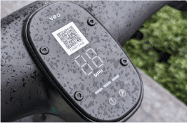
The LED display was unreadable in daylight.
What we saw
Riders could not see their speed on daytime rides. Opinions on how much speed actually mattered were mixed.
Why
Low contrast between the LED and its grey surround — and on a commute riders want navigation, not speed.
So what
Dissatisfaction, a safety risk from eyes off a narrow trail, and prime handlebar real estate spent on trivia.
Recommendation
Raise brightness and contrast, angle the display to cut glare, prioritise information riders actually use, and move speed into ride history in the app.
“I was confused, I couldn’t see the mph. I was kind of hopeful that I could see that.”
P7
05
Riding experience
Severity 2
Riders preferred the throttle — but new riders never found it.

What we saw
New riders ignored the throttle entirely and assumed they had to pedal.
Why
The throttle was unlabelled, and the pedals were ineffective because of the vehicle’s weight and resistance.
So what
New riders wobbled and tipped in their first thirty seconds — the highest-leverage moment in the funnel, and a high de-adoption event.
Recommendation
Label the throttle, cut pedal resistance, and raise seat and handlebar to open up seat-to-pedal distance. Consider an education-mode speed cap and smoother acceleration off the line.
“Oh my god, so much anxiety!”
P4
06
Vehicle design
The instruction sticker was ignored, and incomplete.

What we saw
Some participants noticed the sticker but did not read it. Most never mentioned it at all.
Why
Awkward position, incomprehensible icons and text, missing essentials — and riders believe they already know how to ride.
So what
A longer learning curve for new riders, no recourse when something goes wrong, and a potential safety hazard.
Recommendation
Striking colours and readable type, a more visible position, real unlock-and-ride instructions, and the same information mirrored in the app.
All eight riders were UW students, 18 to 35. The only split we ran was prior experience: four who used rideshare e-bikes and scooters, four who never had. Height we logged and never tested, and it broke something anyway: smaller riders could not lower the kickstand, and posture changed it too.
Severity 4 is the top of our scale, and the kickstand earned it from young riders in a controlled test. The scale stops there. I don’t know that the problem does.
Half the failure happened before anyone sat down
Half the experience happens before anyone sits down, and the app produced one of the study’s two highest-severity issues.
Scanning
Severity 4
Riders could not unlock the vehicle by scanning the on-vehicle QR code with their phone’s default camera: it opened a link that never loaded. New riders reach for the camera first. Tapping scan inside the app produced a payment window most people did not expect.
“The most difficult part in the app in the entire process is scanning… I didn’t know what to do after that.”
P3, new rider
Recommendation
A multifunctional QR code, prompt feedback and fast loading, visual instructions on the vehicle, and an explanation of payment before it appears.
Payment
Severity 2
A $10 minimum deposit sat against a ride that costs $1 to unlock plus 39¢ a minute. Participants thought $10 was reasonable in principle but could not work out why they were being asked for it, or what happened to the remainder. Apple Pay failed outright for some.
“It wants $10 from me, but it said it costs $1 to unlock so now I’m confused why it’s taking more money from me.”
P4
Recommendation
Charge the exact amount after the ride, make the deposit terms visible up front, and investigate the Apple Pay failure.
Safety information
Severity 1
Experienced riders noticed Veo’s safety quiz was shorter than Lime’s. The content was useful but repetitive, and the illustrations showed scooters rather than the vehicle parked in front of them.
“This is for scooters. Right, that’s probably not the case for this bike. So that’s a little confusing.”
P4
Recommendation
Keep the information available but let people skip it, put per-vehicle instructions behind an information menu, and state how many questions the quiz has instead of calling it short.
Everything else we logged, ranked
Alongside the six headline findings, every issue we logged was rated and ranked — including the app-side problems that never made the headline list.
Kickstand
Severity 4
Recommendation
In-app instructions, or a one-sided kickstand
QR code
Severity 4
Recommendation
Multifunctional QR, faster loading, payment terms before the paywall
Pedals
Severity 3
Recommendation
Less pedal resistance, lighter vehicle
Payment
Severity 2
Recommendation
Charge the exact amount after the ride
Throttle
Severity 2
Recommendation
Better labelling, consistent movement
Speedometer
Severity 2
Recommendation
Increase brightness, reduce glare, prioritise critical info
What we told Lime
Everything above collapsed into two recommendations for Lime’s vehicle programme.
01
Curb appeal
Design a Class II e-bike along the lines of the Cosmo-E, but keep the utilitarian features riders actually use: storage and navigation. And inspect the fleet for damage on a real cycle — graffiti and dirt cost more rides than any feature gap.
02
Ride experience
Ship clear instructions, both in the app and on the vehicle, for people riding one for the first time. Then fix the three hardware pain points: the kickstand, the throttle and the pedals.
Lime sponsored this study while deciding whether to build a seated, throttle-driven vehicle of its own. We presented the findings to Lime’s user research and vehicle R&D teams at the end of the project. In 2024 it piloted two: the LimeGlider, seated and pedal-free with a compartment under the seat, and the LimeBike, with a hand throttle alongside pedal assist. A shipped vehicle doesn’t say what it read.
Three things sit near what we wrote: a throttle instead of pedal assist alone, storage built into the vehicle, and a lower step-through, which we had logged as worth keeping. One went the other way. Both run 20-inch wheels, down from 26. On the one with pedals, that is a cost we had logged: less distance per stroke.
Lime says both are aimed at women and older riders, against a base it reports as around 70% men. We did not test that rider.
Nothing I can find touches either severity-four failure. Both were on the Veo vehicle we tested, not Lime’s to fix — and the failure class is still open: the stand, and the scan. That is what the four screens go after.

Lime’s e-bike with a hand throttle alongside pedal assist, 2024

Lime’s Gen-4 seated e-scooter, piloted from 2024
Designing the stuck moment
Each screen answers one failure we logged, at the moment a rider is stuck. A screen with no traceable finding is not here.
Four screens I drew in 2026, in Lime’s current interface language, against failures we recorded on the Veo vehicle in 2023. Never built, never tested, not Lime’s.


Better wording would not have fixed this
I used to treat first-run instructions as an information problem: if riders don’t know, tell them. We listed four reasons the sticker failed. Three are defects in the sticker itself. The fourth we wrote down ourselves: users believe they know how to ride. And no wording reaches a kickstand a smaller rider can’t lower while the ride clock runs. P6 said that alone there, they’d have assumed it was because they were dumb.
So what I’d change isn’t the sticker. It’s a stand that doesn’t sort riders by how tall they are, and a clock that doesn’t start until the wheels do. I design the stuck moment now, not just the one before it.
How the study ran
Everything below is the method and its limits: what we tested, who we recruited, how the sessions ran, and what we would change. Method is evidence, not narrative — it is here for the reader who wants to check the work.
Lime sponsored the study to settle one decision: whether to build a seated, throttle-driven vehicle of its own. So the vehicle we put people on was a competitor’s — Veo’s Cosmo-E — and Lime’s own Gen-3 e-bike was the benchmark.
Study goals
01
Evaluate Veo’s user experience end to end — the app and the hardware together, not separately.
02
Assess curb desirability — which vehicle people pick when both are parked in front of them.
03
Inform the development of Lime’s next-generation vehicles.
Research questions
Q1
What are people’s impressions of the Cosmo-E compared with Lime’s e-bike?
Q2
What usability challenges do riders hit in Veo’s app?
Q3
How easily and successfully do riders engage with the vehicle itself?

The three study goals as they were framed for Lime, with field footage from the sessions.
Two interfaces that a rider uses within the same few seconds: a phone app and a vehicle. Veo’s Cosmo-E is a Class II seated e-scooter — throttle-driven, step-through frame, centre stand, no basket. Lime’s Gen-3 e-bike is pedal-assist, with a front basket, a phone mount and an adjustable seat post.
The comparison was deliberately lopsided. Participants rode the Cosmo-E; they judged the Lime e-bike parked at the curb. That shaped what the study could and could not claim — and it is the first thing I would change.
Eight University of Washington students, aged 18 to 35, split evenly by experience — because the two groups fail in different places.
4
active riders
Already use e-bike or e-scooter rideshare services
4
new riders
Had never ridden an e-vehicle of any kind
5′0″–6′2″
stature range
2 short, 3 medium, 3 tall
4 / 3 / 1
women / men / non-binary
Age range 18–35
Recruiting across the height range mattered more than we expected. Two of the six findings — the centre stand and the pedal-to-seat distance — only surfaced at the ends of it.
Every session ran the same four phases, and then moved outdoors.
Session structure
01
Intro and background interview
02
Curb-appeal interview, with both vehicles parked and nobody riding yet
03
Seven tasks on the vehicle
04
Post-study questionnaire and interview
The seven tasks
01
Download the Veo app and explore it
02
Get the vehicle ready to ride
03
Walk it to the starting location
04
Short ride around the courtyard
05
Longer ride on the Burke-Gilman Trail
06
End the trip
07
Find out what the trip cost and how long it took
Mercer Court
A quiet, secluded courtyard. Riders practised turning and stopping in a small closed circle.
Burke-Gilman Trail
A real shared-use trail. Riders had to manage pedestrians, other bikes and higher speeds.

The four session phases and the two environments — a closed courtyard first, then the live trail.
Three things I would change if I ran this again.
Put people on both vehicles
Participants rode the Cosmo-E and judged the Lime e-bike at the curb. Half the comparison rests on what people said about a bike they never rode.
A longer ride-along, in better weather
A Seattle winter capped how far we could push the trail rides, so the longest task was still a short one.
made in Seattle with ❤️