
Refactoring a live
design system
with AI.
How I used AI to refactor, clean up and fix Dynery's design system — three eras of decisions, one iOS payments app — and then re-cut it so the whole team can run it without me.
In a payments app, our active buttons looked disabled.
Built by the previous designer.
Mine — some MVP components inherited, most built to that year's decisions.
This case.
primary-container role existedThe app pre-authorizes money when you join a table. A control that reads as dead is a trust problem, not a polish problem.
“the whole light-tint side was unfinished — full of TBD”
Our taste moved. So did iOS.
iOS 26 → 27: directly referenced instances changed style even after Swap Library
All-Open-Sans had started to feel cold as the brand matured. At the same moment Apple's Liquid Glass reset what “native” looks like. Both pressures hit one file.
I could not read a file this size by hand.
I briefed AI the way I'd brief a design lead.
The judgment stayed mine; the generation was delegated. The brief audits the old system verbatim first, so before/after is provable.
One hue-stable ramp. One neutral ramp. One real “active light” role.
Names what our greys already were: iOS system grays.
#FF3B30
#FF8D28
#FFC957
#34C759
Warm lives here, and nowhere else.
Every pairing labelled with its contrast ratio in the brief — because the brief demanded it.
The serif I specified is not the serif we shipped.
The brief's rule: one serif, applied across the whole heading tier.
Specimen shown in the page's type
Specimen shown in the page's type
Newsreader sits closer to the brand's tone and is the face the planned UI iteration standardizes on.
The tokens became a typed theme, so the decisions can't be forgotten.
// tokens.ts · one source of truth, light + dark
export const teal = {
  100: '#CCEBE6',   // primaryContainer · new role
  700: '#00696B',   // brand primary (locked)
  900: '#00494A',   // onPrimaryContainer
};

theme.colors.primary          = teal[700];
theme.colors.primaryContainer = teal[100];
theme.colors.fillDisabled     = 'rgba(229,229,234,0.35)';

// Button.tsx
<Button variant="soft">Save for later</Button>
// disabled: neutral grey @ 0.35 — never a teal tint
React Native shaped the design back: static font weights, unitless points, no backdrop-filter. Handing off RN tokens is now part of how I deliver — I'm not responsible for the code, but the front end I built helped engineering land it.
The new tokens existed. The 26,747-node product file did not know yet.
From refresh to repair.
A refreshed token set is a promise. The live file — three button generations, hundreds of Apple-kit instances — is where the promise gets tested.
Own the component. Borrow only the aesthetic.
Liquid Glass is a material, not a component identity. Radius is one token — capsule ↔ 16 in one switch.
“Adopt the liquid-glass aesthetic — drop the liquid-glass dependency.”
consolidation landed · ~700 instances decoupled · (creator's account)
AI read all 26,747 nodes and handed me a scope of work.
Done by hand this was about a month of my time. It read as a real cleanup project — itemized. Then I re-verified before assigning a single hour of it.
The first thing I checked did not survive.
Same screen. Opposite conclusion.
Colour, spacing, radius and type counted as one number.
Colour separated from spacing. The same 32 bound nodes, a truthful denominator.
56% active · 44% parked or hidden
the model counted the dead space
#1a1a1a “hardcoded” hexteal-500 / teal-700#3C3C43 @ 60%#7272725 of the 16 errata rows.
“AI scales whatever counting rule you give it — including the wrong one.”
“good archiving inflated the defect count — the rule must subtract dead space first”
The real defect was in the system — and it needed a decision, not a find-and-replace.
Restrict the token to non-critical supporting text; document the exception.
A solid ≤ #767676; #727272 = 4.81:1. The road not taken.
I set the counting rule — active canvas only, color separate from spacing — and wrote it into the monthly regression, so the baseline cannot mislead itself again.
The system was mine to run. The question was whether anyone else could.
From a system for me to a system for the team.
Everything so far made the system correct. None of it made it usable by someone who is not a designer.
“What are you actually saying to the AI?”
— our head of brand partnership & investor relations, at a daily standup, after seeing my comments on a PostHog readout
the angle and the data visualization struck him — the charts were AI-generated too
The advantage was never the model. It was design judgment written into the instructions. Keeping that as a personal edge would be stubborn.
I re-cut the system for readers who can't open Figma — people and agents.
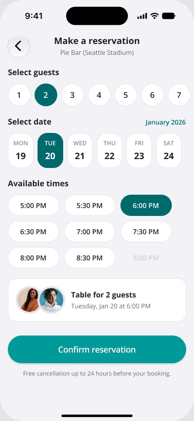
built by the COO on the same system
(creator's account)
What an external stakeholder needs is rarely a developer-ready screen. It's a framework that renders fast enough to communicate and demo with.
The next version is for people who are not designers at all.
Brand color + a quick-guide rail on every document
Which chart explains which concept
A light visual style guide so a non-designer can build an on-tone demo from their own idea
The system's next users are the people furthest from design.
The status board.
Refreshed token system — 248 variables in the migrated library
SupportedTyped React Native theme, light + dark
SupportedEngineering adopted the tokens; RN tokens now part of my handoff
Creator's accountButton consolidation, ~700 instances decoupled, migrated in batches ordered by the corrected metric
Creator's accountSecondary-text decision (follow Apple, restricted use, documented exception)
Creator's accountLight version in use by the other six people; the COO's screen is the proof
Supported (screen)Creator's account (rollout)Home Banner — the serif's first bounded product use
ReadyLight version, next iteration
PlannedNo user-facing metric is claimed. The outcome is a system that is correct, owned, cheaper to audit, delivered as tokens, and now run by people other than me.
made in Seattle with ❤️