
Back
est. 3-5 min read
Interaction Design
Design System
Mobile app
LLM Application
Agile
B2B2C
Leadership
Featured • Design handed off
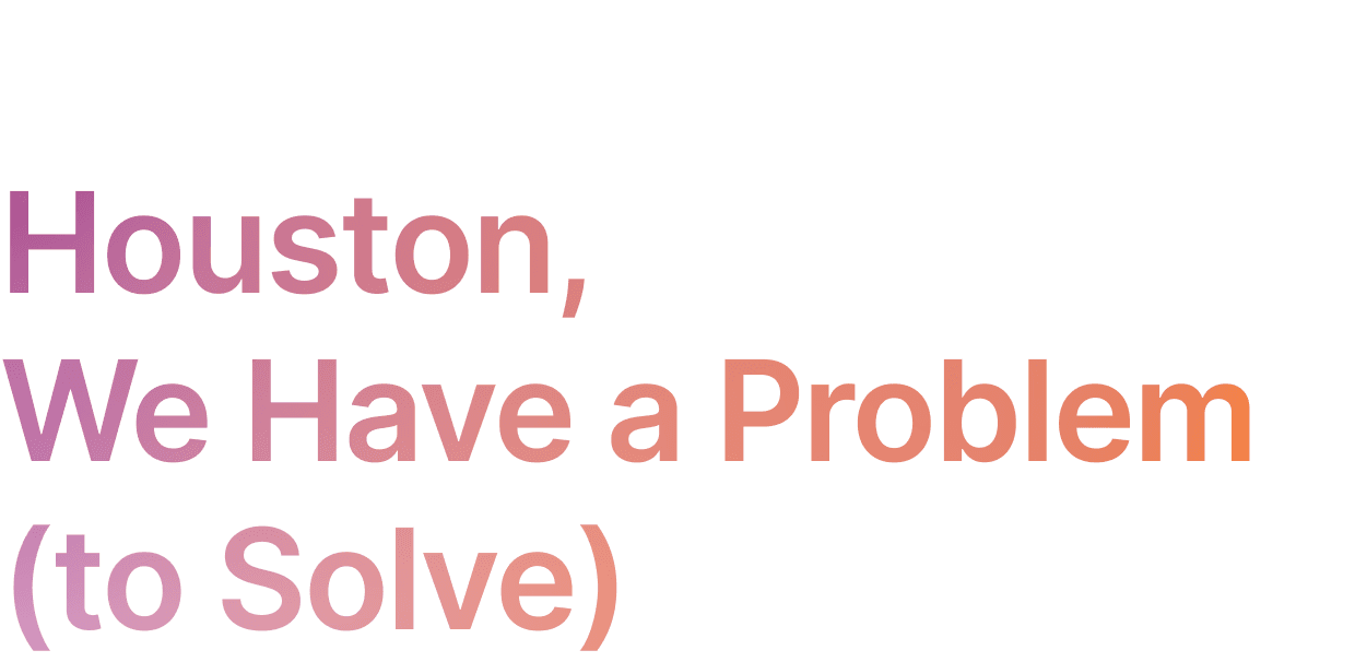
Leading iterative product design with Agile method to solve a complex problem in dining space
In this case study, Dave will share his journey of leading the product design of Dynery mobile app‘s design process that enables seamless digital dining experience for independent restaurants and foodies.

🌟
A quick message from Dave
Before we dive in
Dynery is an ongoing project that I am actively leading as a Product Designer.
Due to NDA restrictions, I cannot share some of the progress or visuals of this project.
If you're interested in learning more about this project, please feel free to reach out to me at dave_cai@icloud.com

MY Role
Lead Product Designer
I owned the research, design, documentation, and maintenance of Dynery app & native design system's component library, pattern library, and style guide.
I also assisted Product Managers with their day-to-day duties such as tracking bugs, feature development and logs.
Collaborators
Founder, CEO, Direct Supervisor
Software Developing Engineering Team
Product Managers
Backend & AI Service vendor
Marketing & copywriting Specialists
Timeline
Feb 2024 to July 2024
MVP Release (private beta via invitation only)
July 2024 to Present
V1.0 Release
Building design system, UI revamp, running usability tests, writing and modifying design documentation
vNext
Running user research, preparing for upcoming features
Skills
Design System
Information Architecture
Interaction Design
Usability Test
UI Design
Prototyping
Competitor Analysis
AI LLM application
Product Management
Iterative Design
My impact
Pioneered in developing, updating, and maintaining Dynery Design System's component library, pattern library, and style guide, with 200+ components within 4 months.
Communicating design with developers, product owner, and other stakeholders in a rapid development framework & bi-monthly sprint environment.
Helped company secured $300k+ investment via interactive prototypes, and pitch decks.

Dynery v1.0 release is a complete redesign of the previous MVP version with numerous UX improvement, and introduced of Dynery's native design system.


Dave takes on the challenge of helping independent restaurants attract their customers and help foodies find reliable recommendations.
The What
Independent Restaurants Are Falling Behind
Independent restaurants make up 70% of the U.S. market but earn only 30% of the industry’s revenue.
Without the digital tools and infrastructure that larger chains have, they’re losing billions in potential sales and struggling to meet modern diners’ expectations for seamless, personalized experiences.

The Why
Independent Restaurants Struggle to Get Noticed
Many diners prefer supporting local restaurants for their unique offerings and community value, yet these independent eateries often go unnoticed due to weak digital visibility.
Dominant chain restaurants overshadow them by offering convenient apps, consistent quality, and loyalty rewards. To effectively compete, independent restaurants need user-friendly digital solutions that boost discoverability and nurture customer loyalty.

Consumers go through multiple apps to discover independent restaurants. For chain restaurants, it’s much easier with 1-stop proprietary apps.
The Who
Independent food & beverage businesses seeking direct engagement with both new and returning customers.
Diners with dietary restrictions or specific preferences who need tailored recommendations that match their needs.
Food enthusiasts looking to discover and connect with like-minded individuals who share their tastes.
Groups and social diners who frequently eat out together and need seamless coordination for their dining experiences.
Indecisive foodies who struggle to choose a restaurant, endlessly switching between platforms and sifting through conflicting online reviews.
The How
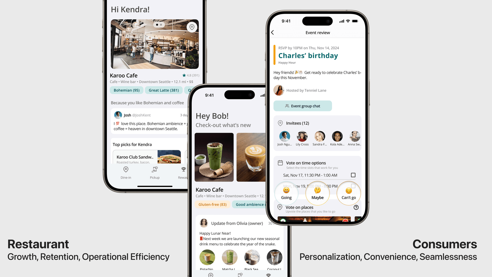
Dynery app (2C - Mobile app)
+
Trofimo Merchant Platform (2B SaaS)
Trofimo's solution bridges the gap between local restaurants and their potential patrons through a seamless, direct digital dining platform, increasing mindshare and patronage.
For foodies looking for great places to dine, Dynery makes discovering process effortless by curating dining experiences tailored to individual tastes.
For merchant, Trofimo Merchant Platform offers frictionless transactions and cost-effective marketing, aiming to increase the growth, retention, and optimize operational efficiency, enabling them to compete and thrive in the digital age.
By investigating real user’s day-to-day activities through interviews and shadowing, we uncover the key painpoints of our target users.
What we heard from foodies all over the world?
Dave led the user research with interviewing 7 participants from North America, Asia, Africa, and Europe
What users complains
What I decided to do
Unreliable recommendations from the wrong people
“There are some people I know for sure that I would not ask for food rec from them, cuz I knew we do not have the same taste for stuff”
Prioritize matching the recommendation result based on users' preferences
Based on the user profile from onboarding and activity history in app such as saved places, lists, Dynery prioritize recommending the places have the most shared tastes.
Fragmented user journey
“When we do our girls-night-out, we literally spent hours on when and where we should go. On at least 5 apps just to find a place and make reservation…”
1-stop seamless integration
Users should be able to complete the whole discover, contact, reserve, dining, transaction, and review without the need of jumping to another app, unless necessary.
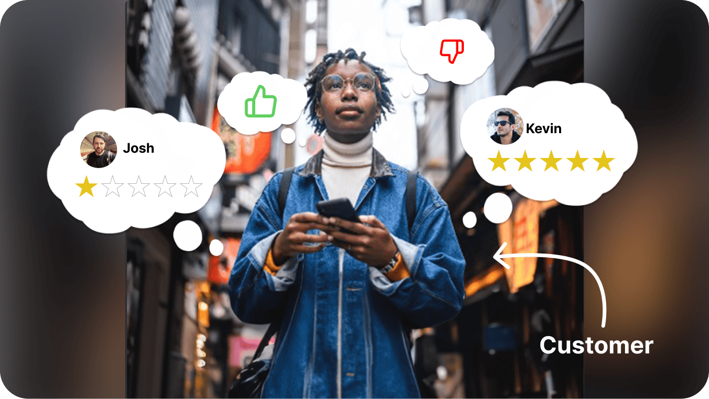
Confusing and conflicting rating scores & reviews.
“Some says it’s (the restaurant) is really good, some says it’s really bad, I don’t even know which one to believe. Also I discovered some place with lower rating is better than the ones with very high ratings”
Reduce the importance of numeric star rating in reviews
Traditionally, the review of restaurants is heavily tied to a numeric rating. However, a number cannot say much about the actual experience. We will prioritize more useful info such as qualitative review from a relevant foodie based on the dining profile.
🍽️
The Data-driven Approach
How did I make Dyney stands out from food apps
After the MVP version rolled out, I collaborated with the stakeholders to decide on the key features we will be rolling out in our public beta based on data from user research & feedback:
Focus on local places instead of chains
Recommendation tailored to users' individual tastes
Catering various dietary restrictions, including the niche ones
Planning dining event with everyone's taste preferences and desired locations
Direct digital connection with the merchants
Seamless in-person dining experience from making reservation to exiting

By utilizing the feedback collected, design thinking, and communication skills, I applied the first principles to craft a solution from raw Ingredients to a gourmet experience.
additional Context
Where did I jump in
I joined the Dynery product team in when the MVP beta version of the app is designed and developed, and being tested by invited beta users.
The MVP beta version supports Dynery’s basic key features such as list, chat, and dining profile, and it mostly utilized lightly modified Material Design components to construct the interface.
Soon, after weeks of collecting user feedbacks, aligning product strategy with stakeholders, and assisting in drafting the product roadmap, I started to work on optimizing interaction flow for hero features, redesigning a native UI, with additional new key features supported, optimizing for product’s global launch compatibility, creating design support docs for developers and conceptualizing the embedded design for features coming to vNext (future releases).
IDENTIFY A STARTING POINT
The Design Question
How might we streamline the experience for foodies to find new place to dine easier that fits their tastes without overwhelmed with mixed information?
An Iterative Process of Getting a Better Solution for Foodies
List of artifacts being used in designing Dyney app
Personas
Interaction Flows
User Journey Maps
Information Architecture
Sketches
Rapid Mid-fidelity Prototypes
Co-Design Sessions
learning user behaviors
How did I create effective personas to identify painpoints better?
P.S. it might be different than what textbook told you to do
Rather than relying on traditional demographic attributes often found in conventional user personas, we prioritized users' actual behaviors and underlying motivations.
Our personas are not hypothetical; they are derived from real users identified through company-led research and MVP testing. By distilling common patterns among these users, we ensured that our design solutions align closely with their behaviors and needs.
persona 1 - Customer side

Kendra - The Explorative Foodie with Specific Dietary Requirements
Kendra loves discovering the dining scenes in her city and she travels frequently.
Kendra lives a gluten-free dining lifestyle. Therefore, Kendra often uses more than 5 apps for discovering, deciding, arranging, dining and sharing her experience.
Kendra often finds unreliable recommendations on apps like Yelp or Google Map, so she barely use them anymore but asking her friends who she knows they have similar tastes.
persona 2 - business side

Olivia - The Local Cafe Owner Struggles to Get Customers Attention
Olivia owns a independent coffee shop at Seattle. Olivia wants to reach out to her potential customers more easily. Olivia is tired of spent tons of time and energy posting on different platforms, but getting very few in return.
Olivia wishes she can have an app for for her new and returning customers to know what’s new, promote, and reward them, like the Starbucks or McDonal’s app, but she neither have the budget nor technical background to create her own website/app that satisfy her needs.
INTERACTION FLOW
How do we make the interaction intuitive, effective & seamless?
By following “the first principle” here’s how I utilize this concept ro build scenario-based interaction flows in my design process.


An example of interaction flows, please contact Dave for more detail
Identifying, Focusing on the Real Goal, Not Just Tasks
A critical first step was to identify the user’s fundamental objective rather than optimizing for superficial milestones. Overemphasis on short-term transactional goals (like "completing a reservation") risks creating unnecessary friction that ultimately distracts from the user’s true need: "Discovering an ideal restaurant and enjoying a memorable dining experience."
Avoiding Solution Bias
We consciously resisted jumping directly to digital solutions when we are drafting the interaction flows. By mapping the baseline interaction flow—how users would naturally achieve their goal without any product intervention—we identified painpoints that revealed authentic opportunities.
This process urged us to:
Challenge our existing assumptions about "user needs"
Distinguish between actual problems and invented requirements
Human-Centered Problem Solving
Even though our final deliverable was a mobile app, we intentionally explored non-digital interventions during ideation.
This approach leverages humans’ innate ability to combine tools and behaviors to solve problems, ensuring our digital solution is complemented, rather than complicated,real-world user journeys.
Collaborative Clarity
Visualizing the complete interaction flow charts created shared understanding across the team. It transformed abstract discussions about "features" into concrete conversations about how each design decision either supported or obstructed the user’s ultimate objective.
iNFORMATION ARCHITECTURE (ia)
How did I inform other stakeholders in team about the upcoming design?
After drafting the interaction flows for the next Dynery release, I shifted my focus to defining the Information Architecture (IA) for each key feature. The IA served as a foundational blueprint, enabling Product Managers and Engineers to preview the feature scope and allocate development resources more efficiently.
The IA became one of the most valuable assets in the design process, providing additional clarity and alignment before diving into actual UI design.
Throughout the project, the team continuously referenced it to guide the creation of design system, prototyping, validation, iteration, and user testing, ensuring a structured and efficient workflow.


An example of IA, please contact Dave for more detail
User journey map
How does an ideal experience of our solution looks like?
I created a series of user journey map to help myself and other stakeholders in team to preview the end-to-end experience looks like before and after applying our solution with a real world scenario that a research participant described.
The user journey maps includes user’s every key interaction touchpoint when they are trying to accomplish their objectives, and furthermore helped me identified major painpoints such as decision fatigue, fragmented digital interactions, and lack of personalized recommendations.
This process helped align design decisions with real user behaviors, ensuring that we deliver a seamless, intuitive, and personalized dining experience that caters to both diners and independent restaurants.

An example of user journey map, please contact Dave for more detail
low to high fidelity protoryping
How did I turn artifacts to screens
Interactive Mobile App Prototype
After key stakeholders approved on product artifacts developed earlier, I started to working on the visual aspect of the product.
Like the whole project, prototyping is also an iterative process.
I started with hand sketches, then wireframes, mid-fidelity prototypes for devs to evaluate, and then high-fidelity prototype & design docs to handed off.
As an early-stage startup, we experienced numerous challenges to ship the product. Thus, the prototyping process requires strong cross-functional collaborative skills and decision-making.


Early stage Sketches


Let’s Start with Some Numbers
4.9 ⭐
App Store rating
$300,000+
Fund raised in 6-months
What our test users say about Dynery
This totally makes dining out a breeze! The personalized matching is always spot on and the process is super convenient and fun.
- “Kendra”, a foodie based in Seattle goes Gluten-free
When is Dynery coming to London? I literally need it for every city I will be traveling to!
- “Ashley”, a London based food lover who travels frequently
How did I Test the Design Before Shipping?
Before handing off the designs to devs, we conducted a two-step validation process to ensure our solutions were not only user-friendly but also technically feasible.
Early Feasibility Review with Developers
To avoid last-minute implementation roadblocks, I collaborated closely with engineers and PMs by submitting the high-fidelity interactive prototype, design doc, and feature specs for early evaluation. This allowed the dev team to flag any high-complexity designs upfront, helping us refine interactions before committing to development.
This proactive approach saved engineering time and ensured we stayed on track with our release timeline.
Usability Testing with Real Users
To validate our assumptions, we recruited users with varying levels of digital literacy and conducted scenario-based usability tests. We observed how users naturally navigated through the interactive prototype without guidance, using think-aloud protocols to capture their real-time thoughts.
One key insight we uncovered was that users struggled to locate a key action button because its placement was too subtle. While I initially designed it for a clean, minimal interface, testing revealed that clarity outweighed aesthetic simplicity in this context. As a result, I adjusted the button size, contrast, and placement, leading to a 40% faster task completion rate in follow-up tests.
By taking an iterative, data-driven approach, we refined critical usability issues before launch, ensuring a smoother experience for our users without adding unnecessary development overhead.
DATA-DRIVEN ITERATION
How did I Iterate on the Feedback
I prioritized data-driven iteration by leveraging insights from user testing and real-world usage data.
After each testing round, I synthesized qualitative and quantitative feedback to identify friction points, usability gaps, and unmet user needs.
For example, if testing revealed that users struggled with finding a way to proceed, I would analyze session recordings, task completion rates, and qualitative feedback to pinpoint the cause.
Instead of relying solely on assumptions, I worked closely with the PM and engineers to prioritize refinements that had the highest impact on user experience with the lowest cost of implementation.
This iterative approach ensured that our design decisions were always validated by real user behavior, allowing us to refine the product efficiently while maintaining a balance between user needs and development feasibility.

To me, this case study isn't just about presenting a perfectly packaged final product in a gift box.
What I truly want to document and share are those raw challenges and insights from my first year leading Dynery's design - the real journey of a designer steering a product toward its public launch.
Strategic Pivots & Validation Through Competition
The Start-up Dillema, Competing with the Giants


Google Maps - 2024 Q4 brand color shift, Old vs. New
Image source: 9to5google
Dynery Insight, a feature powered by large language models, was positioned as one of our flagship features. But technical complexities and development costs forced us to make an agonizing decision: postponing this cornerstone capability to our next major release. This wasn’t just about resource allocation; we were acutely aware that tech giants such as Google was charging full-speed toward similar AI integrations in its mapping services.
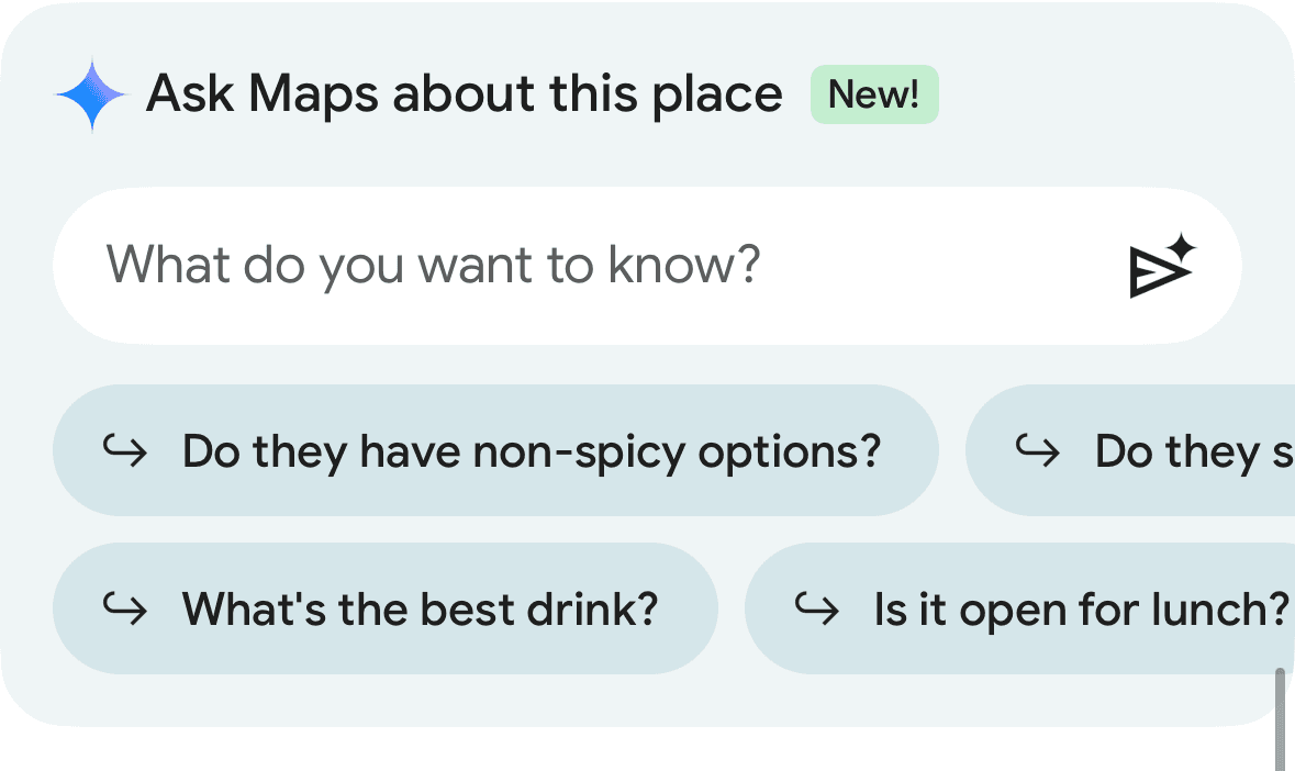
2025 Q1 - Google Maps AI Integration
Image source: 9to5google
The competitive landscape intensified rapidly. In Fall 2024, Google Maps adopted a cyan color scheme strikingly similar to Dynery’s brand palette – then doubled down by embedding Gemini AI-generated restaurant summaries. By January 2025, their beta launched AI-powered conversational search. While these features superficially mirrored our roadmap. That being said, we still recognize our unique advantage compare to a general map app.


2025 Q1 - Apple Invites
Image source: Apple
When Apple unveiled its native-designed Invites in February 2025, I experienced equal parts validation and anxiety. Our interface explorations showed uncanny parallels with Apple’s design language, despite working in complete isolation.
This "design telepathy" confirmed we were tracking industry currents, but also highlighted our David-vs-Goliath reality.
Here’s what keeps us fighting: While tech titans can deploy armies of engineers overnight, our nimbleness and vertical focus let us perfect what they can’t: deeply understanding independent restaurant owners and their clientele. Every pixel we design serves their specific operational rhythms and customer engagement nuances.
When Product Priorities Collide with UX Vision
How We Navigated Competing Agendas Without Compromising Core Principles
As designers, we strive to create inclusive, user-friendly experiences that cater to diverse needs.
However, in real-world product development, we must also balance user needs with feasibility, scalability, and development resources.
A Recurring Debate
Should we optimize the experience that may only serve a small subset of users?
One example was a discussion I had with the Product Manager regarding whether to include a supportive button or contextual text in certain UI screens. I believed that adding these elements would enhance usability for some users, preventing confusion and improving accessibility. The Product Manager, however, took a more holistic view, arguing that:
This feature would likely serve only a very small fraction of users.
Not having it would not have a detrimental effect on overall UX.
Adding it across the product would increase development time considerably.
Keeping the UI lean aligns with the principle of simplicity — less is more.
Both perspectives were valid. While I didn’t want minority user needs to be ignored, the PM had to consider the overall efficiency of product development.
How I Resolved the Debate
Instead of making an immediate call, we aligned on a pragmatic approach
If the absence of this feature does not create a destructive user experience failure, we would hold off on implementing it.
If post-launch user feedback strongly indicates a need, we could iterate and add it in future updates.
This prevented premature feature creep, ensuring that we only built what users truly needed, rather than what we assumed they needed.
This experience reinforced that design is never static, it’s an ongoing, iterative process.
Instead of trying to design for everyone upfront, the best approach is to listen, launch, learn, and adapt. By designing with scalability in mind, we ensure that the product evolves based on real user demand, rather than hypothetical assumptions.
Real-world challenges
This Ain’t Like Any School Project
When I graduated from UW’s Human Centered Design & Engineering master’s program in June 2024, I thought my experience leading student projects and corporate design teams had prepared me for anything. But stepping into a startup leadership role taught me a harsh truth: nothing in academia simulates the crucible of real-world product ownership.
The Weight of Ownership
Previously, whether as a Staff Product Designer, a design intern, or the sole designer on a student project, I could always escalate difficult product or design decisions to a manager, mentor, or instructor for guidance. However, during my time at Dynery, I was the final decision-maker responsible for ensuring the quality and viability of the user experience.
This shift in accountability led to intense debates with product managers, especially over fine details that directly impacted the user experience. When disagreements arose, the best way to back up my design rationale was always through user testing and data-driven insights. At times, I also had to step back, give myself space to reflect, and avoid falling into self-confirmation bias—a challenge that every designer faces when deeply invested in their work.
In short, below is what I learned:
Data as the Ultimate Arbiter
When disagreements reached impasses (and they did), user testing metrics became our shared language
The Art of Strategic Retreat
Learning to pause heated discussions, revisit designs after mental resets, and audit my own confirmation bias
Embracing “Good Enough” for the moment
Shipping imperfect-but-functional solutions when engineering constraints demanded compromise
Dancing with Constraints
Unlike at well-funded companies, where resources are more flexible, working at a startup in the midst of fundraising meant that every dollar spent had to be carefully justified. As a designer, this translated into high expectations for clarity—any miscommunication or ambiguity in my designs could result in wasted development efforts, costing thousands in resources.
Every pixel carried cost implications in our bootstrapped environment. Therefore I adopt a forward-thinking approach to design:
Ensuring reusability by leveraging scalable design assets
Prioritizing compatibility with existing design systems and components
Involving engineers early in the design process to identify potential development bottlenecks before committing to complex, resource-heavy solutions, like having developers gut-checked designs before pixel perfection
By embedding engineering collaboration from the start, we were able to streamline feasibility assessments and avoid unnecessary development costs—a crucial factor in a resource-constrained startup environment.
Nope, I don't have a final answer
"If I claimed to have mastered these challenges, I’d be lying."
This past year has been one of the most challenging yet rewarding experiences of my career. It reinforced not only my design expertise but also my ability to think strategically, collaborate cross-functionally, and make high-stakes decisions with confidence. I am honored to be a part of this journey.
If you are helping your team get through the similar problem , I’d love to bring a cup of coffee and chat with you .
Sections
made in Seattle with ❤️