
Onboarding: Good design. Wrong order.
Onboarding is every new user’s first interaction with the product — and I rebuilt Dynery’s twice. The second time, I overturned my own 2025 design. The first rebuild was cleaner, faster, and better-looking than the MVP, and users walked through it without friction. They still didn’t build the one thing the product needed. The fix wasn’t better craft. It was sequence.
* team-measured · backend · cumulative † PostHog · production · 2026 · how each number is sourced ↓

The 2025 rebuild, running — recorded from the shipped build. All three tested clean, and all three are still in production today.
Faster
Sign-up became the only gate — splash, verification, the basics. A median 24 seconds to the home screen in testing.
Easier
The profile module, now optional — add your places, set dietary needs, find people. The flat tag wall became structured categories.
Warmer
An invited user lands on the invitation rather than a cold start — respond to the group now, or skip into the normal flow.
Activation meant a profile, not a signup.
Dynery’s curation runs on a dining profile — the recommendations only work once one exists. Users who set up stay; users who don’t churn early. So the metric that mattered was profile completion, and one constraint shaped everything: we were brand new.
A signup the product can’t personalize is an empty seat, not a user.
Profile → curation → return visits. Everything downstream starts here.
In production: diners who build a profile in week one return over the following month at ~2× the rate of those who don’t · PostHog · Mar–Jul 2026 cohorts · correlation, not an A/B
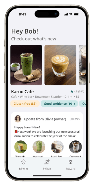
We were brand new. Nobody had a reason to believe us yet.
One question drove the 2025 rebuild.
“What is the absolute minimum a user needs in order to understand this product and start using it?”
Split one flow into three modules
The minimum needed to start is an account. Everything else is something the product wants. Sign-up became the only gate; quick actions and the profile wait until they’re wanted.
Gave up guaranteed profile data at signup — a patchier day-one picture in exchange for users who actually reach the app.
Defer the profile — keep the prompt quiet
Mature social apps treat setup as ambient: a nudge you can ignore, never a wall. I borrowed the restraint.
Quiet works where trust exists. I didn’t price in that we had none. This is the decision the rest of the case examines.
Ask for permissions in context, never in a batch
Each request now arrives when the feature needs it, naming what it buys the user — not as a stack of pop-ups at the end.
The efficiency of asking once. Some permissions arrive late or never — a lower ceiling, but consented.

The step I’d defend hardest produced no screens.
A first encounter with a product is a social problem before it’s an interface problem, so I worked it in sketches and analogies from ordinary introductions before opening a design file. That’s where “show value before asking” came from. What it couldn’t tell me was how much value a stranger needs to see first — that gap is the rest of this page.
Every decision held up under that question. The question itself was incomplete.
Three changes, shipped and validated.
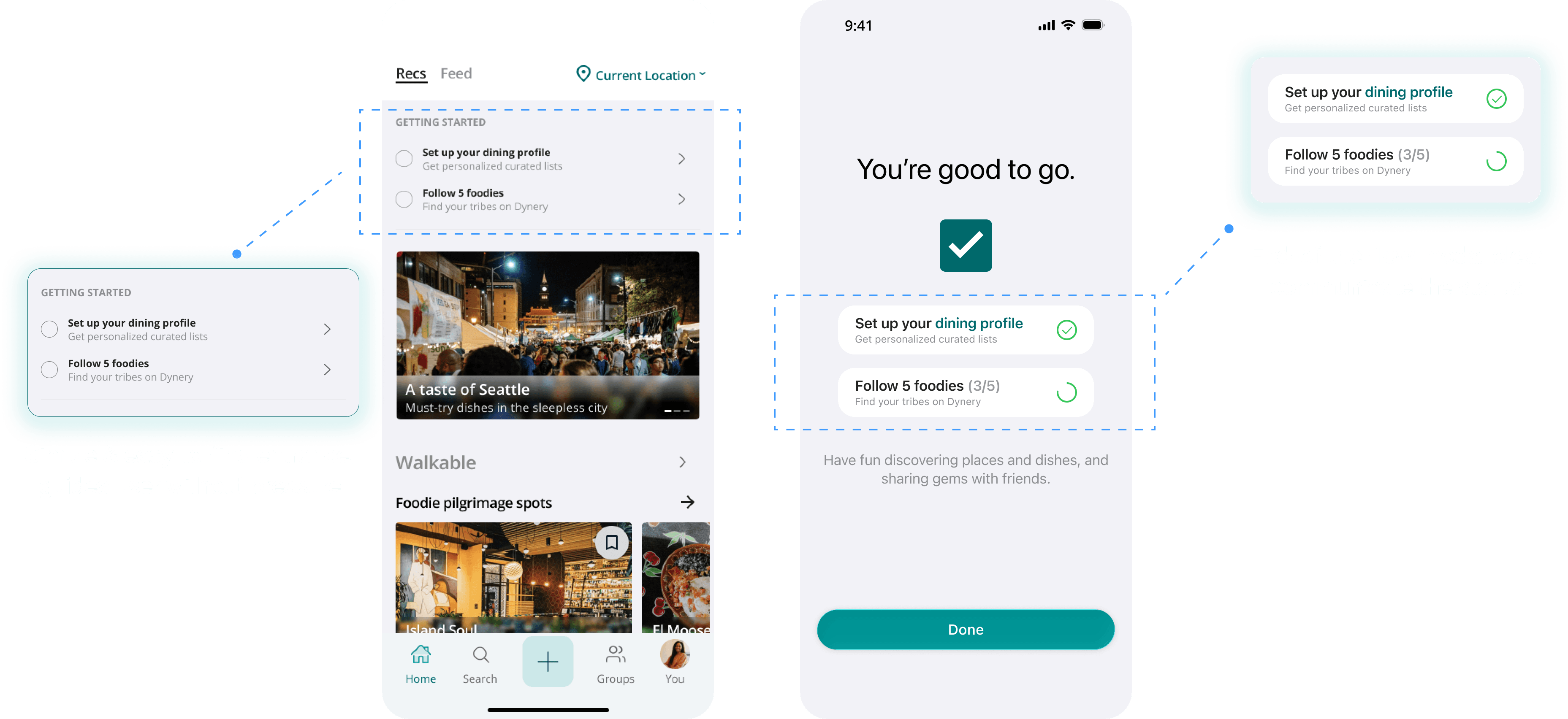
Twelve mandatory screens became three modules. Every change below tested clean — keep that in mind for §04.
Modularized the flow
Account first; quick actions optional; profile whenever wanted.
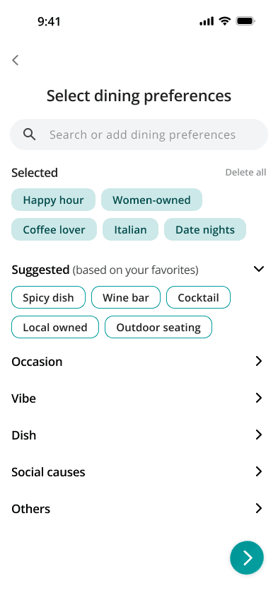
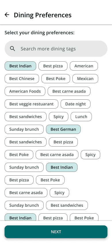
Restructured the tag picker
Flat tag wall → collapsible categories, pinned selections, split color coding.
Moved permissions into context
End-of-flow pop-up stack → just-in-time asks that name their benefit.
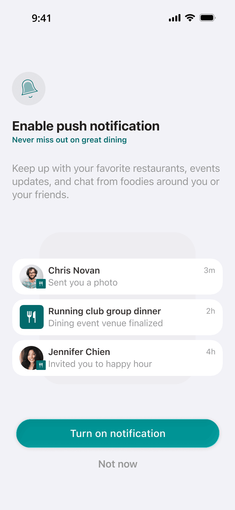
Validation: a clean bill of health.
10-participant moderated usability testI feel like I keep seeing this screen many times.
Iterated: the add-a-place loop now runs continuously instead of returning to the same confirmation screen.
I wanna see who’s in the group before I join.
Iterated: a bottom sheet now shows the group before anyone has to commit to joining.
Moderated test environment, measured against the MVP flow — not production data
It worked by every measure I was looking at.
And they didn’t build profiles.
The flow held. The pull was missing.
My first instinct is the one this case is about: “the flow works, people complete it, so the design is fine.” That instinct protects a design instead of a product. I traced where new users actually went after registration.
The trust gap
Restraint reads as respect inside a product you rely on — and as absence inside one you downloaded ten seconds ago. Same pattern, different credit.
The orientation gap
I had designed for someone who already knew what Dynery was for. Nobody did.
A pattern’s risk isn’t a property of the pattern. It’s how much credit your product has with the user on the day they open it.
The obvious fix was pressure. We didn’t ship it.
Gate the feed until a profile exists
It probably would have moved the number, fast. But a gate spends credibility, and we hadn’t earned any. Forcing a door doesn’t make anyone want what’s behind it.
Show what a profile buys — then ask
The problem was never that users refused to invest. We had never shown them why it was worth it.
The gate was the fast fix on the table, and I argued against it — which meant I owed the team something better than a no. §06 is what I brought back.
Show value first. Then ask.
Seeded the feed with living profiles.
A newcomer’s first screen now shows five example Dyners — filled-out dining profiles with real taste, real places, real curation. Personas we built at first; signed influencers as the base grew. You see what a profile buys before anyone asks you to build one — each Dyner’s screen ends in their own curated lists, the output rather than the form. Shipped in late June 2026.
Touring the five — tap any Dyner to take over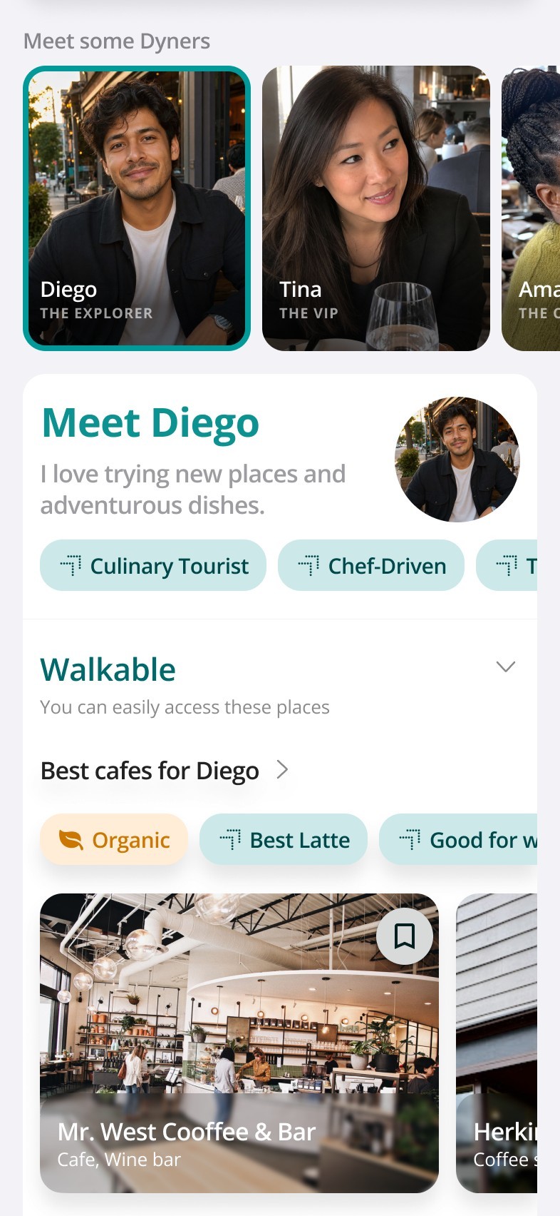
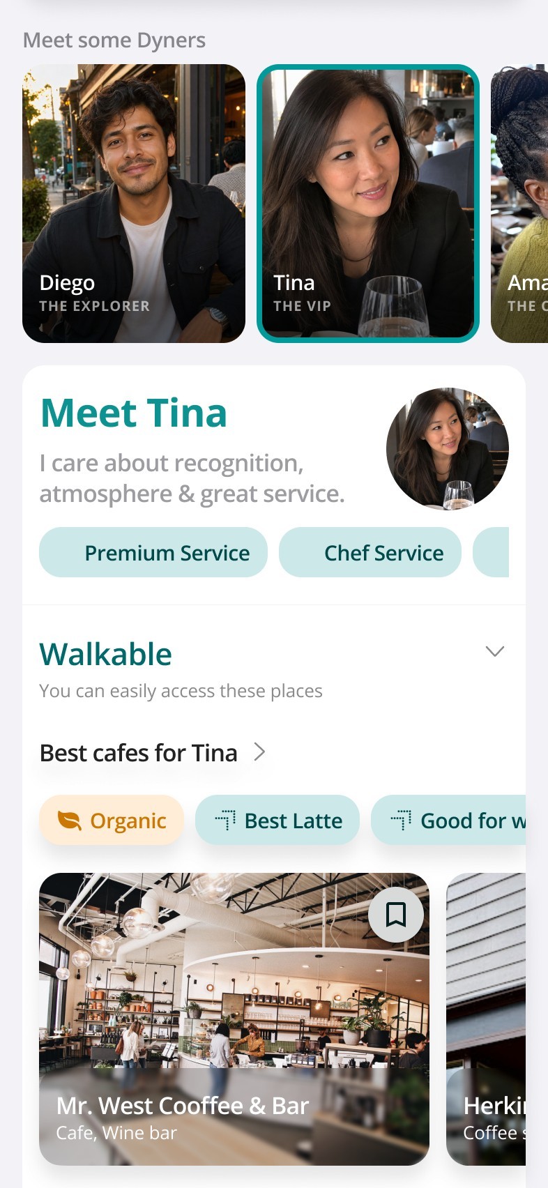
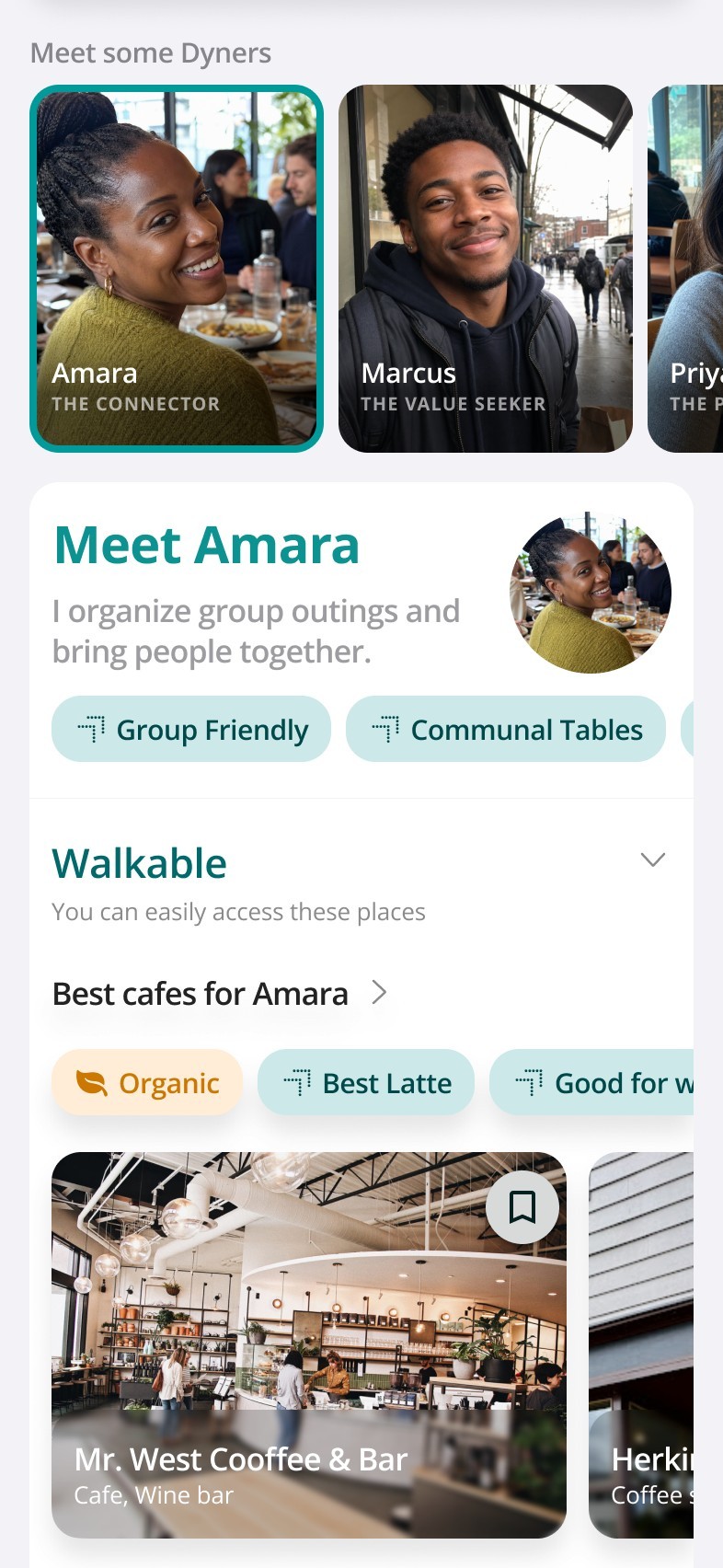

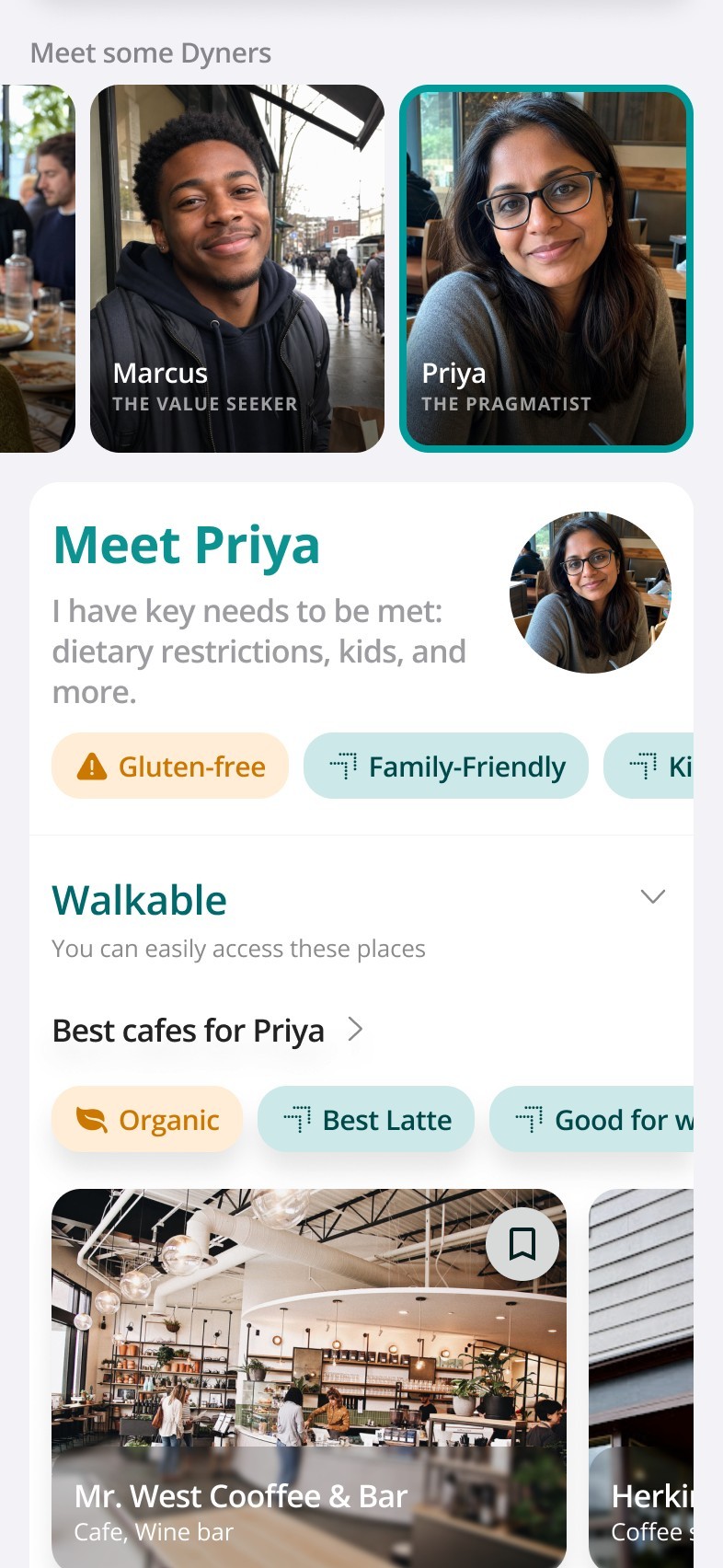
They’re the five typical users Dynery is built to support — and a menu for self-recognition. The newcomers this screen serves don’t have a dining profile and usually don’t know what one is. Explaining it in copy, or recommending against an empty profile, barely converts. Recognition does: “this one’s like me” is the moment a profile stops needing an explanation — and starts looking worth building.
“View more curated lists by finishing setting up your dining profile.”
Seeded the feed
Example profiles make curation visible on first open — and make Dynery legibly not-Yelp.
Made the value legible
The getting-started now answers “why would I set this up?” before asking anyone to.
Kept the 2025 craft
The visual work stayed in production. It was never the problem.
The shape of the fix — I didn’t make the onboarding better. I made the thing before it do the work the onboarding couldn’t do for itself.
What moved — and how each number is sourced.
Activation versus launch across the recovery period. Product-team result — not a controlled A/B, and not mine alone.
7-day activation lift isolated to the seeded-feed release: four weeks after vs four weeks before.
Median time to complete a dining profile, monthly. Same task, roughly a third of the time.
Reading notes — not an A/B test · instrumentation changed the same week as the rollout, which if anything biases these numbers down · no absolute rates published by policy
What lasted
“Prove value before the ask” is now how we model onboarding — every new surface starts from it.
What I’d tell myself in 2025
- ✓On a product users already trust, I’d make the same call again — and be right.
- ✓I upgraded the craft and left the sequence alone. Craft was never the bottleneck.
- ✓Judge onboarding by activation, never by completion of the flow.
made in Seattle with ❤️